Foundations of Better Handwriting
Most handwriting problems are not about talent. They come from how the body holds the pen and how letters are shaped, both of which respond quickly to a few deliberate changes.
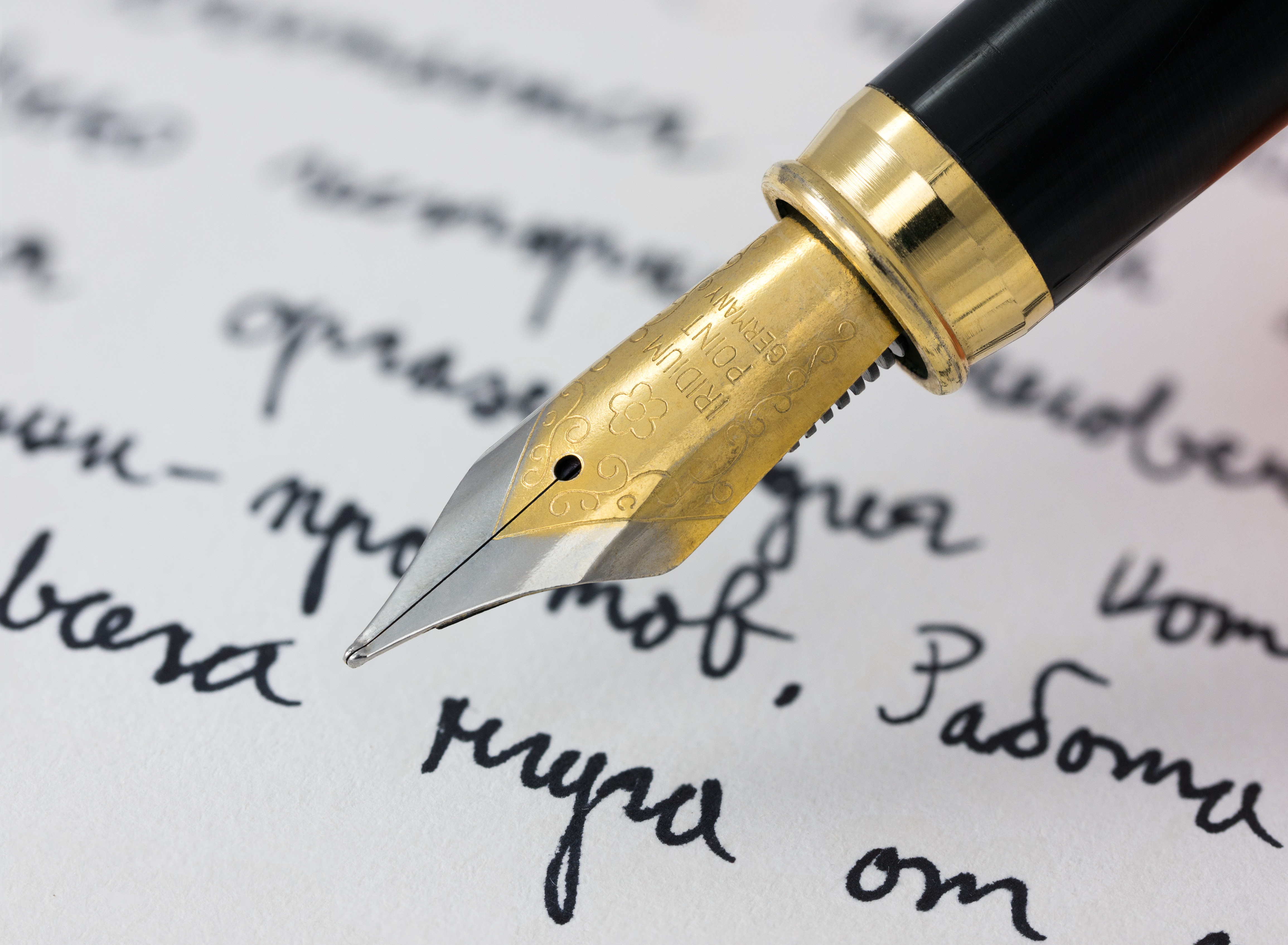
Setup: paper, posture, grip
Before changing how you write, change where you write. Sit with both feet on the floor and the writing surface roughly at elbow height. Square the paper to your forearm rather than to the desk edge: for right-handed writers the sheet usually tilts slightly left, and for left-handed writers slightly right, so the wrist stays straight.
The grip should be loose enough that someone could pull the pen from your fingers with light resistance. A common, comfortable hold is the tripod grip — thumb and index finger steady the pen while it rests on the side of the middle finger. If your fingers whiten or ache after a paragraph, you are pressing too hard.
Quick test
Write one line normally, then write the same line trying to let your whole arm move rather than just your fingers. The arm-led line is usually steadier and tires the hand less. That movement, not finger strength, is what carries longer writing.
Letter forms and consistency
Legible handwriting is consistent handwriting. Three properties matter more than the particular shapes you choose:
- Slant. Pick one slant — upright or slightly forward — and keep every letter on it. Mixed slants are the most common reason handwriting reads as untidy.
- Height. Tall letters (l, h, k) should reach a steady ceiling; short letters (a, e, o) should sit at a steady mid-line. Ruled paper with a midline helps train this.
- Spacing. Keep the gap between words about the width of one lowercase "o". Even spacing does more for readability than the shape of any single letter.
You do not need to adopt a new alphabet. Choose the letters that already cause trouble — often a, g, and the joins between them — and rebuild those, leaving the rest alone.
Three short drills
These take a few minutes and work as a warm-up before any longer writing session.
| Drill | What you write | What it trains |
|---|---|---|
| Parallel downstrokes | A row of evenly spaced vertical lines | Consistent slant and spacing |
| Connected ovals | A continuous chain of overlapping ovals | Smooth, arm-led movement |
| Single-letter rows | One troublesome letter, repeated across a line | Stable height and shape |
Write each drill slowly the first time, then once more at normal speed. The aim is not perfection but matching shapes — every oval the same size, every downstroke the same lean.
A legibility checklist
After a page of normal writing, read it back as a stranger would and check:
- Do all the tall letters reach roughly the same height?
- Is the slant the same across the page?
- Are word gaps even and clearly wider than letter gaps?
- Can ambiguous pairs — a/o, n/u, e/i — be told apart at a glance?
Whatever fails the check is your next single-letter drill. Working one fault at a time is slower to describe but faster in practice than trying to fix everything at once.
When you are comfortable with the everyday hand, the natural next step is choosing a tool that suits decorative work — covered in Calligraphy Pens & Nibs — and then a script to practise, in Script Styles & Stroke Practice.